We all know there was a big home price run-up in the first part of this decade. That's true everywhere and it's true in MB.
Now, for the first time, we can see just how extreme the price rises were in MB, specifically. (Click either graph to enlarge.)
This is MBC's third story built from a database compiled by…
We all know there was a big home price run-up in the first part of this decade. That's true everywhere and it's true in MB.
Now, for the first time, we can see just how extreme the price rises were in MB, specifically.
(Click either graph to enlarge.)This is MBC's third story built from a database compiled by
DataQuick Information Services, purchased by a loyal reader and made available to the blog author.
In our first story, we noted that
fewer homes sold in MB in 2007 than in any of the 19 previous years. In our second story, we charted the dip in home prices throughout the 1990s, noting a
34.6% drop in inflation-adjusted (real) prices and a 10-year recovery period from peak to return-to-peak. (See "
The 90s: What a Drag.")
Now we're looking at changes in the median prices for homes from January 2000 through the end of March 2008. Note that the data here include all homes – SFRs and condos and THs – in all parts of MB. The inclusion of non-SFR sales tends to bring down the median prices somewhat from what you'd see with SFRs alone.
The two separate series in the first chart come from the same data, although one series (the top two lines, in blue and red) is adjusted for inflation, showing values in 2007 dollars. The bottom series (green and orange) uses the values reported from each year without any adjustment.
The local RE bubble's rapid inflation is most apparent between 2002-2006. Let's work with that bottom series. Here, the green, jumpy line shows the median price of all homes (SFRs, THs and condos) sold in a given month. The orange line shows the 12-month moving average – the average of that month plus the 11 months before it. The moving average smooths out seasonal factors and limits the problem of small samples sizes month-by-month.
The price explosion is vivid. Just take the lowest and highest dollar amounts of the 2000s – the 12-month median rose from $631,250 at the turn of the century to $1,646,958 in Jan. 2008 – an astonishing
161% increase. That's right, nominal home prices
were nearly triple their 2000 values 8 full years later.
When we look at the same comparison points using inflation-adjusted values, the rise is a slightly more modest
91% –
a near-doubling – from $865,264 in Jan. 2000 to about that same $1.6m+ figure in Jan. 2008.
So how fast was the rise? We pulled out a few points along the upward slope (on the nominal-price graph):
- Prices rose 20% between Jan. 2000 ($631,250) and May 2002 ($754,610) – 27 months;
- Prices rose another 35% from the May 2002 level through Oct. 2003 ($1.019m) – 17 months;
- Another 26% increase occurred in just one year, through Oct. 2004 (to $1.280m); and
- Yet another 24% rise over Oct. 2004 prices came over the next 2 full years (to $1.588m).
That October 2006 peak was followed by mild deterioration in the average median price over the next 13 months. Note that the month-to-month swings (in green) became more pronounced during this period, too – partly because sample sizes were shrinking with fewer monthly sales.
In something of a surprise, the 12-month moving average recovered in Nov. 2007, hitting $1.625m, and rose to a new, recent peak ($1.646m) in Jan. 2008.
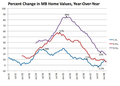
The rate of price increases was startling, so we prepared a second graph to look at the rates of change year-over-year.
(Click to enlarge.)Here we use the 12-month moving averages and nominal prices to show how much the median price grew year-over-year. We also prepared 2-year and 3-year comparisons.
The peak of the purple line (3-yr. comparison), for instance, shows that a home was worth 86% more in April 2005 than it had been worth in April 2002.
The somewhat steadier blue line, showing year-over-year price appreciation, went over 10% in Nov. 2002 and stayed above that threshold until June 2006. That means that, for a bit less than 4 years, you saw homes rise in value by 10% or more every year. In between, the graph shows a first peak at 28% YOY in Aug. 2003, and a second, higher peak at 30% in Jan. 2005.
Appreciation went briefly negative in Aug. 2007, at -3.3% YOY, although the figure ticked up again afterward – just like we saw in our surprising finding that the moving-average median price went up in recent months.
Going back to the first graph, there's no precedent in this overall 20-year dataset for a doubling or tripling of prices in a short span of time.
The price recovery from the mid-1990s slump saw a rise in price of about
50% over 5 years and 10 months. (From the trough just below $600k,
inflation-adjusted, in July 1994, back to the July 1990 peak a bit over $900k, inflation-adjusted, in May 2000. See "
The 90s: What a Drag.") Prices then rose
another 80% over the next 7 years, 7 months in our bubble years.
–––––––––––––––––––––––––––––––––––––––––––––––––––––
Nerdy NotesImportant caveat: The charts are imprecise in one respect – we are using
monthly median prices for all of this analysis. Even the 12-month moving average represents a smoothed average of 12 monthly median prices, which is not the same as the "true" median for that particular 12-month period. The "true" median could only be calculated month-by-month by DataQuick using the actual sales records for 243 months that went into this dataset. We believe this representation is accurate and certainly illustrative, but it necessarily falls short of that ultimate precision.
Sources: The figures presented here come from a dataset produced by DataQuick Information Systems. Data for sales of one-family homes (including SFRs, THs and condos) in Manhattan Beach were purchased by an MBC reader and forwarded to us. (Thanks!) We have permission to create and publish charts and analyses using the data, but we cannot provide substantial amounts of the source material, per the agreement with DataQuick. (In other words, they want to keep their raw data private.)
Adjustments for inflation were made using data published by the U.S. Dept. of Commerce, Bureau of Economic Analysis. We used the bureau's implicit price deflator figures for residential investment, the figure most appropriate to home prices. These figures are published for each quarter of each year; therefore, each quarter's worth of median price data has been adjusted separately, rather than using an annual figure for each year's data. Quarter 4 of 2007 is the base figure used for all the adjustments – not only are we using constant 2007 dollars, but Q4 '07 dollars.
Please see our blog disclaimer.
Listings presented above are supplied via the MLS and are brokered by a variety of agents and firms, not Dave Fratello or Edge Real Estate Agency, unless so stated with the listing. Images and links to properties above lead to a full MLS display of information, including home details, lot size, all photos, and listing broker and agent information and contact information.